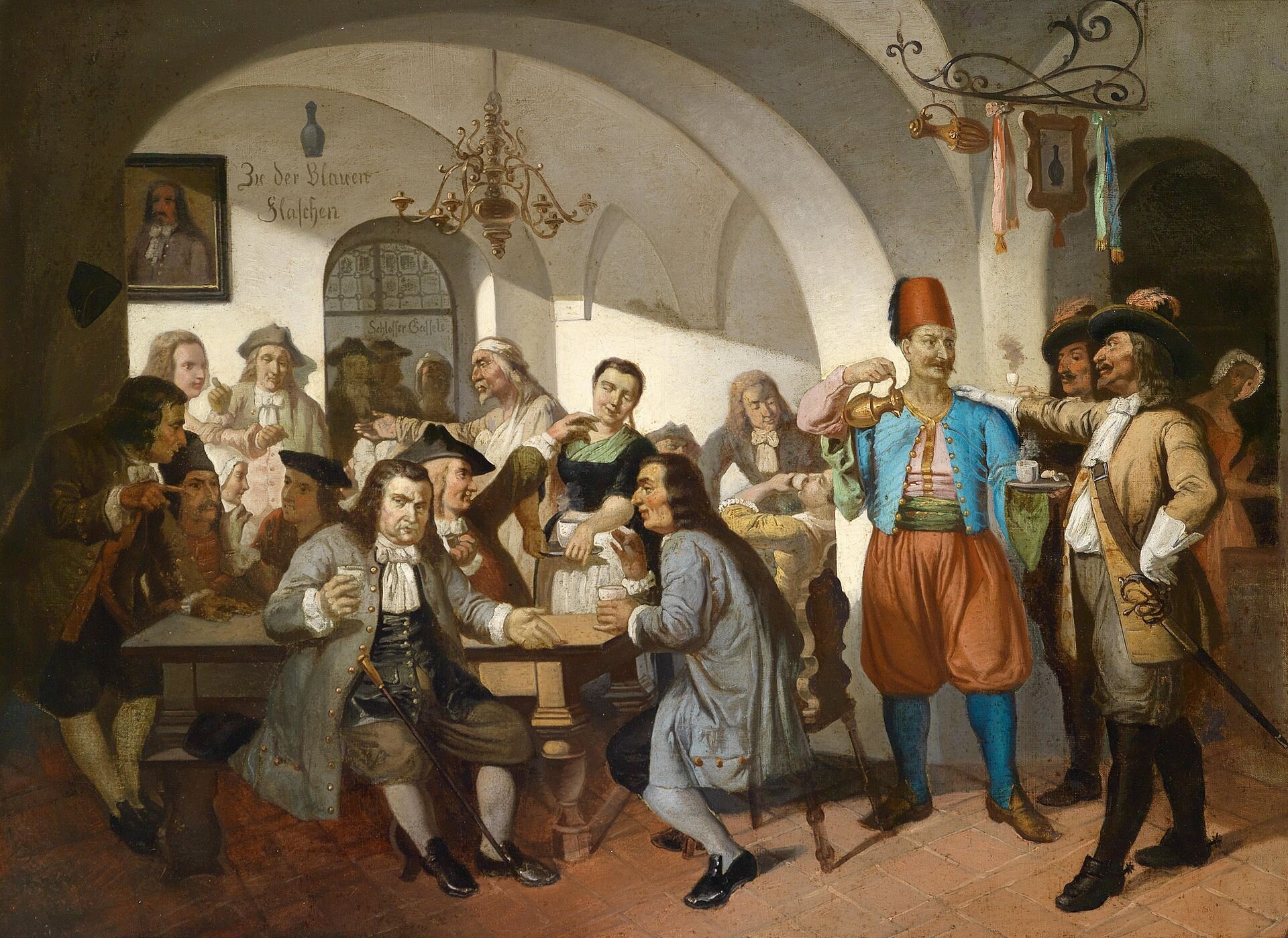
COFFEEHOUSE
Coffee culture has lost the communal experience of the Enlightenment-era coffeehouses and the cognitive load of brewing pour-over coffee is tooheavy on the brewer to facilitate an engaged experience that can buildcommunity.
We are enabling the brewers of today to facilitate communitybuilding through the participation in the ritual of coffee artistry
Target User.
We considered this product serving as a Coffee Station for coffee lovers, at the same time, it also provides engagements for the audience.
Storyboard
#Prototyping 1
Summarized Design Elements
Circular/oval base with fixed and dedicated location for brewer
Raised platform that is for consumer UX (cups, serving ware, etc.)
movable
boundary/border of circular/oval base
Incorporated storage (2-3 drawers) into circular/oval base
Components are not fixed, removable for independent use
Glass space where consumers/brewer can write
User Test
The three user tests aimed to understand how the brewer can engage and educate the community while brewing coffee. Both tests highlighted the importance of the brewer's interest and comfort in performing and sharing their knowledge with the community.
The community was mainly interested in conversations surrounding coffee and the sensory experience of the brewing process.
The tests emphasized the need for the design of the brewing station to support the brewer's confidence in sharing their knowledge with the community.
Incorporating modularity and built-in sections can make the process more intuitive for the brewer and the community.
#Prototyping 2 — Parallel Test
Design decision from #1:
Brewer needs to know where things go, and doesn’t want to have to think about where to put things when they’re done using it
Waste - dedicated space for solid and liquid waste generated during the brewing process
Visibility - the ability to comfortably shift focus from coffee brewing to community in order to multi-task easier
Functional for individual brewing AND community brewing
Tester also
User Test:
#Prototyping 3
Design decision from #2:
Tester like the storage room for the compact one but prefer the circular shape for the open one
Prefer to see the same shape language continues from the tools.
Flow of operations is still not intuitive enough to follow


